Navigation has long been an essential factor in human life. We have had a sense of curiosity since the beginning. Humans have wanted to explore the far reaches of the world. Maps were our way to spread this knowledge and educate people about the world.
Maps can be as beautiful as they are helpful. In this article, we will take a look at some of the different types of maps, their uses, and the history of maps. We consider their design and how you might integrate more maps into your life.
The Definition of a Map
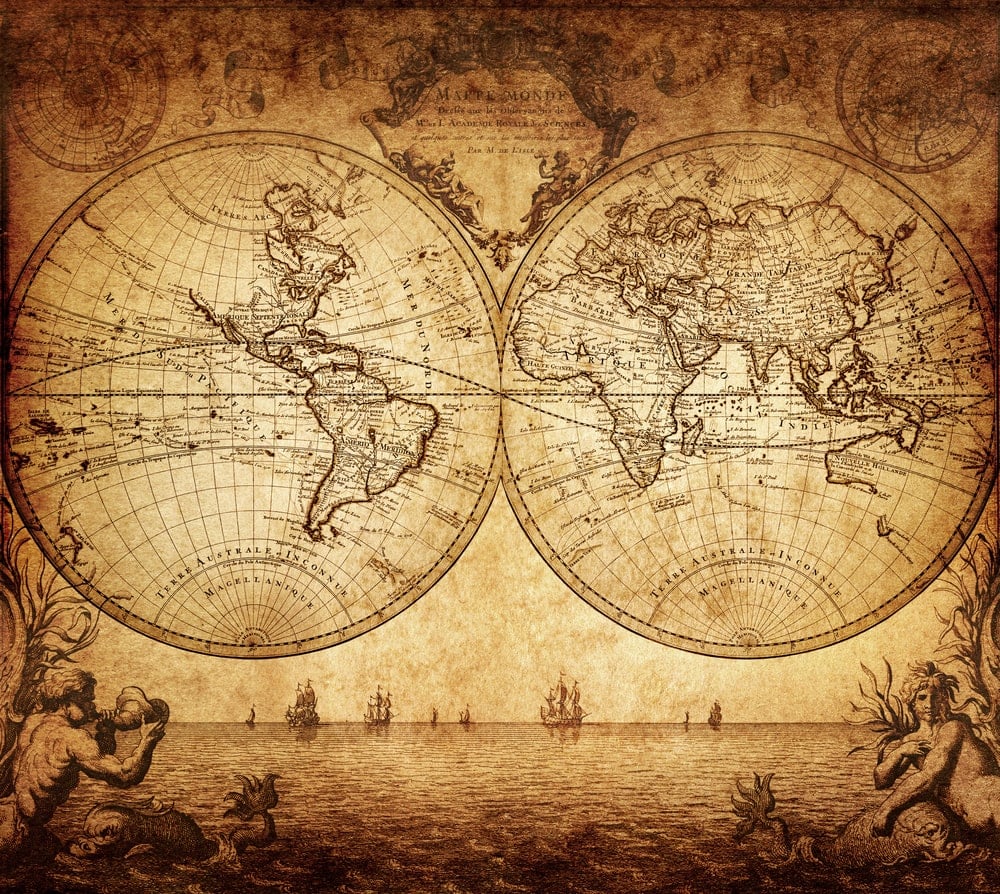
The definition of a map might seem relatively straightforward. However, it is helpful to have a solid understanding of what we mean when we talk about maps throughout the article.
Maps record locations of interest or communicate information relating to the geography of a mapped area. Maps are also most often represented on a flat surface as compared to globes that are spherical representations.
The Landmarks of Mapmaking History

The history of mapmaking is lengthy and full of more twists or turns than any map in the world. The methods of mapmaking have changed and evolved with our understanding of the world. The evolution and integration of technology has transformed map-making to incredible levels of detail.
One factor that makes the history of mapmaking challenging is its worldwide development. The varied historical points are another facet. Globalization has made much of the global mapmaking homogenous. However, it hasn’t always been that way.
The view we give to the history of mapmaking is essentially European, but it did not spread evenly across the Earth. Mapmaking is one of those fascinating areas of study. Even with technology, we still use many of the pictorial techniques developed thousands of years ago.
Maps In The Beginning
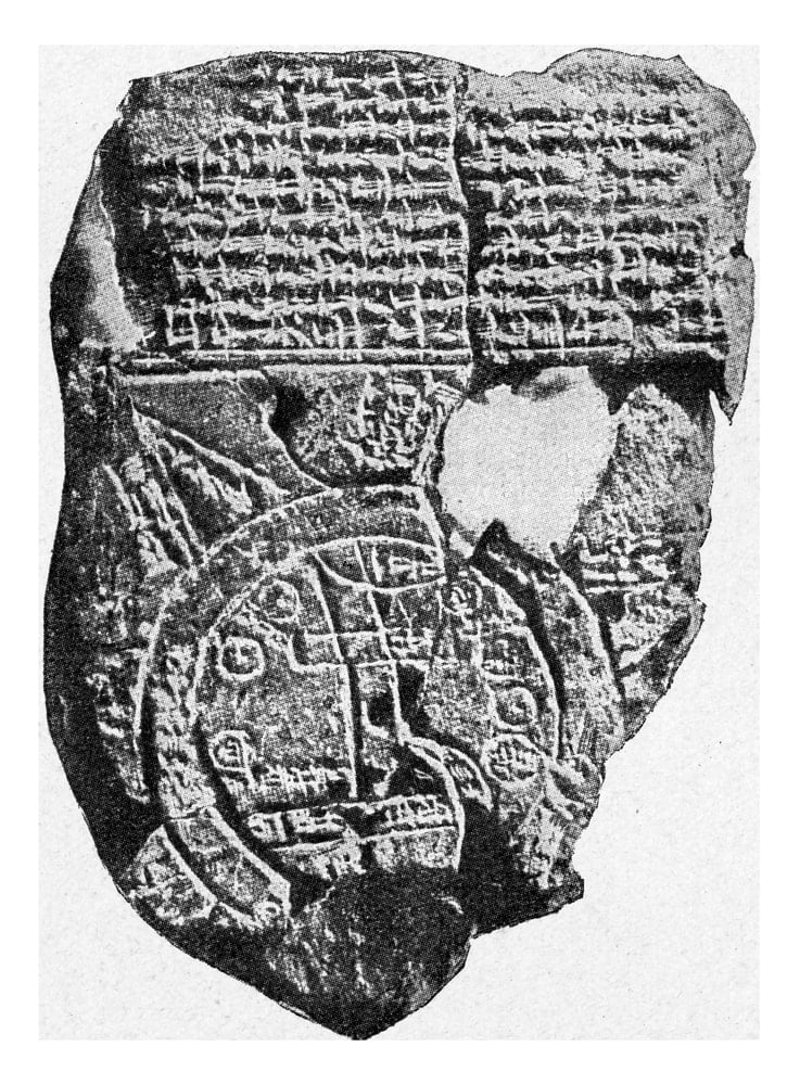
We can trace the history of mapping back to more than 5,000 years ago. We have tablets of Babylonian clay depicting maps of the surrounding areas.
Other examples that have been found dating before 4 BC include beautiful, hand-crafted maps on silk from China. These were as much art as they were informational.
Contrasting the artistic nature of maps in China, the extensive work done by the Egyptian empire was meant for informational use. They recorded property boundaries and the extent of the Pharaoh’s land.
Ptolemy’s World Map
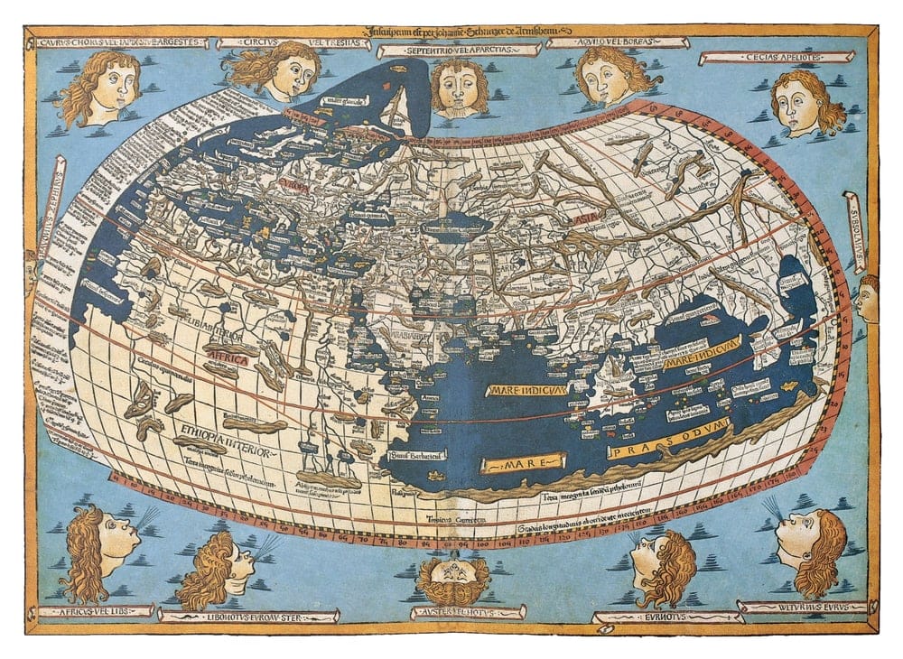
Claudius Ptolemaeus, or Ptolemy, led the next significant milestone in mapmaking. He produced a world map in 1482. His world map was the culminating work of the Greeks and Romans, who strove to better maps’ accuracy and artistic work.
Ptolemy was a well-respected mathematician, geographer and astronomer. He lived in Roman Egypt and used his skill in mathematics to make estimates and divide the world into sections.
Ptolemy’s map was most notable due to his use of longitudinal and latitudinal lines. In addition, he used celestial observations to base the location of terrestrial places. Unfortunately, the book was lost to the Western world until translated from Greek into Latin in 1407.
His book challenged many of the basics of medieval mapping and helped to change their understanding of the world. It helped make mapmaking more accurate in the end, even though many of Ptolemy’s calculations would later prove incorrect.
Maps In The Middle Ages
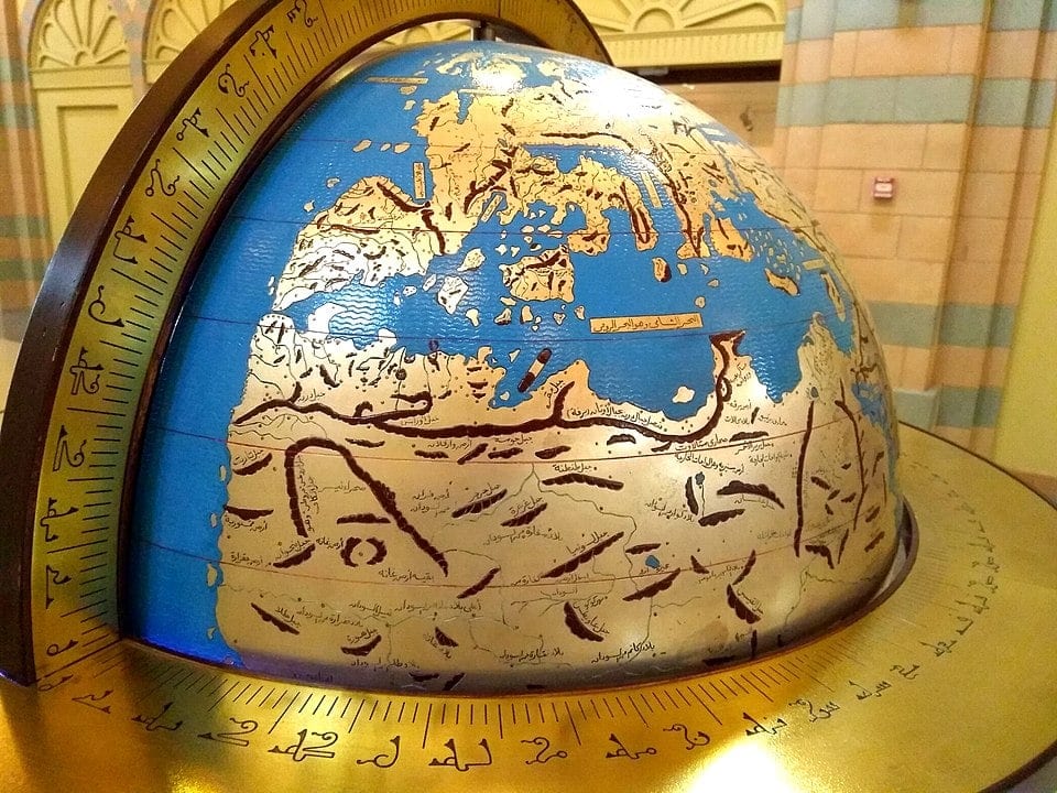
S N Barid / CC BY-SA 4.0 / Wikimedia commons
From early AD through the first millennia, Europe made very little progress with improving its mapping. Most of this is due to the slower development of civilization away from tribal groups after the Romans left.
One of the reasons for the slowdown of mapping during this period is because monasteries produced most maps. As a result, accuracy and mathematical calculations were of far less importance. Instead, most map developments were dominated by religious zeal. This focus skewed their accuracy.
Even though the Europeans didn’t make significant strides forward in the Middle Ages, the Islamic world saw progress. One of the examples of their progress forward was work done by Al-Idrisi.
Al-Idrisi was an Arab geographer who lived from 1100 to 1165 AD. He wrote the Book of Roger focused on world geography for King Roger II of Sicily. Along with this large geography of the world, Al-Idrisi produced a silver celestial sphere with a map of the world produced in disk form.
Al-Idrisi’s work was an intriguing collaboration between Ptolemaic influences and Arab tradition. His work was highly influential from its conception in 1154 through the 1600s.
Maps In The Renaissance
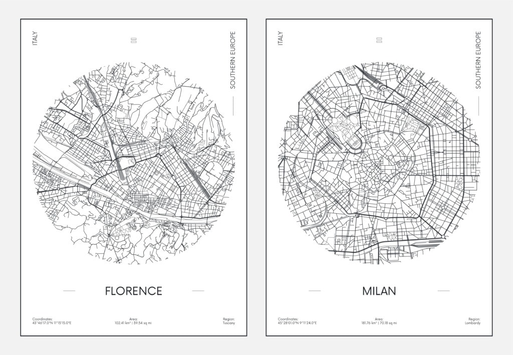
The slow progress from the Middle Ages was hugely contrasted by the Renaissance. During this era, there was quick progress in cartography.
Some of the changes, such as the invention of the printing press, aren’t directly related to mapping. However, their influence on the progress of the modern world swept cartography along with it.
Other changes that significantly affected mapping were the discovery of America and the opening of the Orient. In other words, the first steps to wider globalization.
Another primary difference in the world of mapmaking was the growth in publishing houses. These began to produce maps that were accessible to everyone, not only the wealthy.
The Renaissance saw a thirst for knowledge brought on by public learning. It helped to push scientific research and development forward. These advances pushed many things forward, including the improvement of navigational charting.
Modern Maps and the Impact of GPS Technology

It wasn’t until the late 1700s that maps began to show specific themes of information. They were no longer simplistic “black-and-white” maps. They only displayed the most basic information. Instead, they showed all kinds of information. They would give further context for surrounding areas.
One example of these themes was the spread of an “event” such as the location of people who had a contagious illness. Another earlier development of a themed map was to demonstrate the extent of a flood area.
Modern satellite systems primarily determine current maps. However, surveying techniques also aid contemporary cartographers in mapping areas with high precision.
GPS, or Global Position Systems, allows cartographers to track and map everyday trends and subtle changes. Some of these trends include things like:
- Traffic
- Common pathways and average time traveled
- Climatic conditions
- Ocean currents
Another primary change that GPS gives us is the ability to find our location within a map. Using a device, such as most smartphones or computers, you can use GPS. It allows you to figure out exactly where you are, the best route for where you are going and how long it will take you to get there.

Many of the old trends of paper mapping are beginning to be phased out. Digital maps are still highly influential to people’s everyday activities. Arguably, maps are even more a part of daily life than they have been in any other millennia.
As maps have been digitized and enhanced, new uses are being created for them. For example, DNA sequencing is done by creating a physical map to show the distances between known DNA sequences on a chromosome.
Another example of a more traditional usage is when maps are utilized for environmental impact studies. These maps help developers, scientists and planners to make firm decisions. The decisions include where to put developments in ecologically sensitive areas.
You May Also Like: Hiking GPS: Everything You Need To Know
Mistakes in Mapmaking: Map Traps
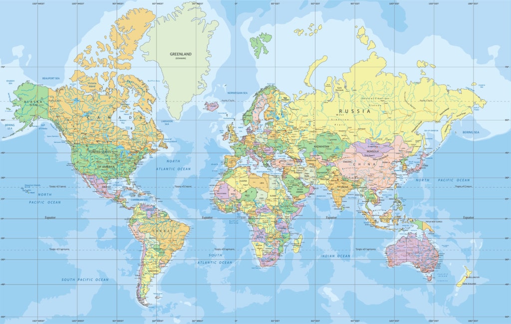
One fascinating part of modern mapmaking is aspects of plagiarism. The way that companies that produce maps protect themselves from plagiarism in interesting ways.
In the modern world, there is very little excuse for maps not to be extremely precise. Map production is a very demanding process that takes painstaking effort. Getting all the details correct, including spelling, locations, streets and walkways, is all-important.
It is this large amount of effort that motivated companies to institute map traps. Map traps are the integration of small fake streets or towns. These allow a copyright violator to be caught if they produce a map with the same fake information. They would be guilty of piracy and would be able to be prosecuted.
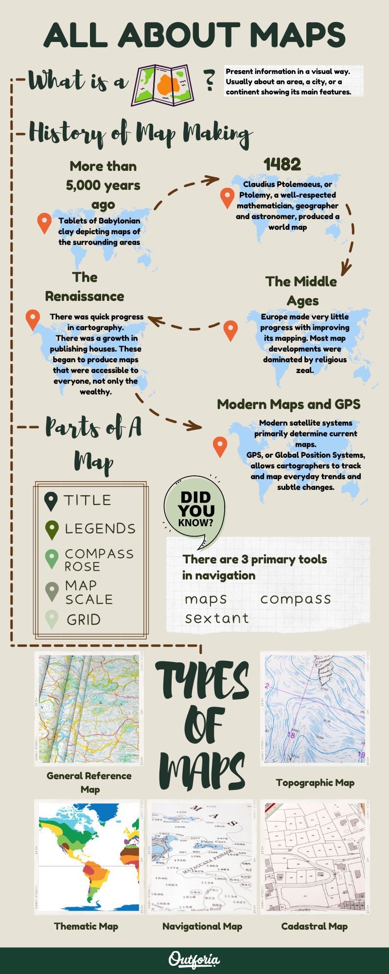
The 5 Different Types of Maps
Share This Image On Your Site
<a href="https://outforia.com/types-of-maps/"><img style="width:100%;" src="https://outforia.com/wp-content/uploads/2021/10/Types-of-maps-Infographic-1021.jpg"></a><br> Types of Maps Infographic by <a href="https://outforia.com">Outforia</a>This heading might be misleading for some people since there are more than five types of maps. These five are the overhead categories of all the kinds of maps you can create. In reality, you can create a map to convey any information you want, so it’s practically impossible to break out all the possible types of maps.
Let’s start with these five primary types of maps and identify some of the kinds of maps that fall under each broad category.
1. General Reference Map
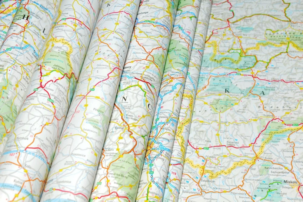
General reference maps show important physical areas. They are sometimes called planimetric maps. These can be both natural and man-made. The purpose is to summarise the landscape and help people discover the locations they need.
General reference maps should be easy to understand. One of the essential parts of creating a map is that they are easy to read, meaning it shouldn’t be overloaded with information. Keeping the data simple is a challenge for any general mapmakers.
Many of the early maps, including those mentioned earlier in the article, fall under this category.
Typically, general reference maps are created in a relief style. They show the difference between the height in different features on the land. It is often meant for a specific reason, such as highlighting the roadways by bolding them or making them a more noticeable color.
Some maps that exemplify general reference maps include street maps and those maps produced for tourists. You can see the primary characteristics of a general reference map in most of these. These characteristics include:
- Many colors
- Named cities and places of interest
- Major transport routes for cars, trains or public transportation
- Elevation
- A theme
2. Topographical Map
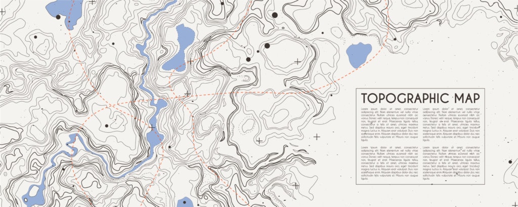
Topographical maps share quite a few characteristics with general maps. However, you will notice some crucial differences if you lay a general and a topographical map side-by-side.
First, you will likely notice that a topographical map seems a lot busier than a general map. As the route of the word “topography” might point out, the primary purpose of a topographical map is to show elevation details.
Often topographic maps are also a summary of the larger landscape. They will display critical physical features, whether they are natural or man-made, from your landscape. Further characteristics of a topographic map include:
- An emphasis on human settlements and borders of specialized land like national parks.
- Showing elevation by using contour lines and spot elevations.
- Well-defined standards that strictly adhere to those set by mapping agencies.
- Exact measurements according to the scale of the map.
- Highly accurate location reference systems such as grid lines, latitude and longitude and a North point.
Government agencies often produce these kinds of maps. The reason for this is the requirement for precision and accuracy. As a result, government agencies can fund the depth of work and measurement to produce accurate topographical maps.
One kind of topographical map is an OS map. An OS map stands for Ordnance Survey and is detailed by the British or Irish government for the United Kingdom.
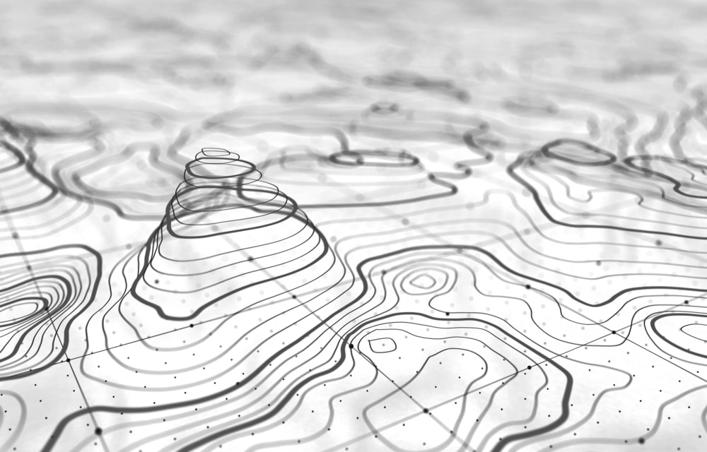
Topographic maps as we know them today are pretty new to the general maps that have been produced for millennia. This youth is primarily due to the development of contours that happened in the 19th century.
Before cartographers defined contours, there were quite a few ways that drawing a relief could be done. These methods included a system called hachuring. Since the invention of contours, these old methods have practically disappeared from use.
The most important part of being able to read a topographic map is understanding scale and contours. Scale is shown with two numbers separated by a colon. The first number represents the object’s original size. The second number represents how much smaller the object is compared to those real-world dimensions.
For example, if a scale reads “1:20,” the objects on the map are 20 times smaller than their real-world dimensions.
3. Thematic Map
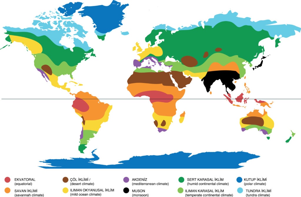
Thematic maps as a general concept depict information related to a particular theme or a topic. It cuts out all the other information so that the only information that shows applies to the map’s theme.
There can be details such as physical information, statistical, measured or interpreted. Some thematic maps will require specialist knowledge from a map user. Some of the more common types of thematic maps include:
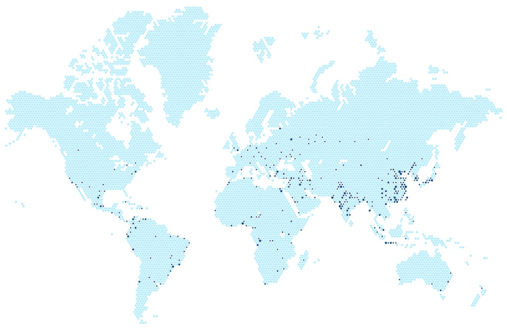
Dot Density Maps
- Dot density maps are those that represent each of the data points on the map with a dot. They are often used to measure the density of populations or a statistic related to the demographic in certain regions.
- On these maps, a high density of dots packed close together are the areas with a high density of data.
- Dot maps are pretty popular and have been around for a long time. They display information in a simple way that has a wide range of applications.
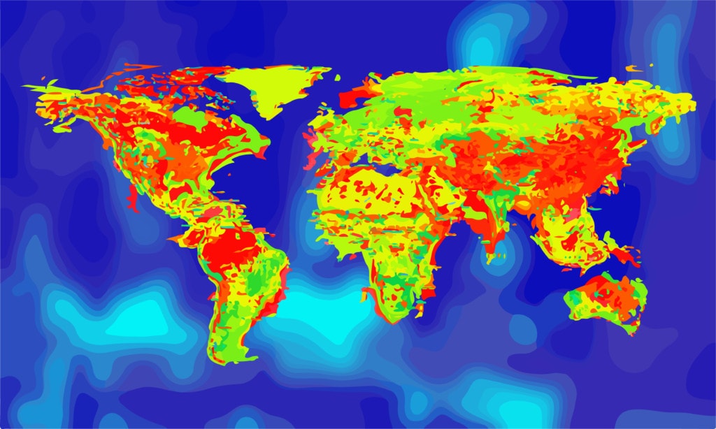
Heat Maps
- Heat maps function similarly to dot maps to display the density of the data that would show up in your theme. Heat maps use various data using colors with a key for the range of numbers that relate to the numbers.
- Darker shades indicate areas of higher density. Lighter shades relate to lower-density areas.
- Something that can be confusing or work to benefit your data is that heat maps don’t use geographic boundaries. Instead, the colors gradually fade out as the density of the areas decreases.
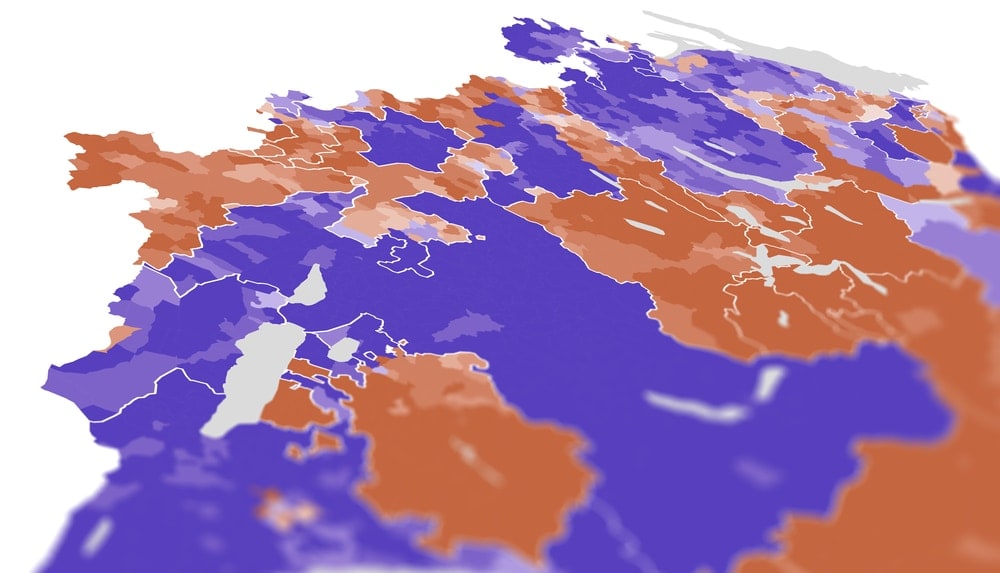
Choropleth Maps
- Choropleth maps represent data in a similar way to heat maps. They show where a data value is relevant on a map by showing different colors and patterns over the top of the geographic area.
- Often, data gets groups into categories or classes for a choropleth map. These categories are then given a unique color or pattern meant to be distinctive.
- Different from a heat map, a choropleth map uses geographic areas to stand for specific areas. As a result, boundaries are often much more defined on these kinds of maps.
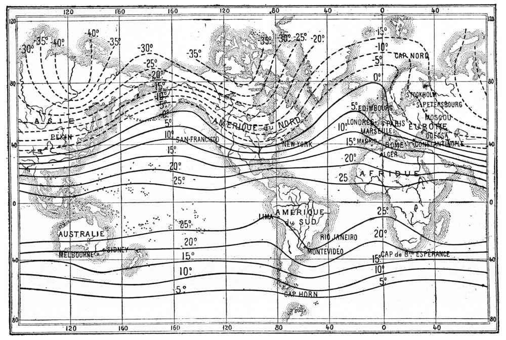
Isopleth Maps
- Isopleth maps also use colors in various shades to display the data similarly to choropleth maps.
- These maps are different from choropleth maps. The data isn’t grouped in specific boundaries defined by the country or state lines.
- Contoured lines define isopleth maps. The map is thus divided into different areas based on the level changes of both contour and data.
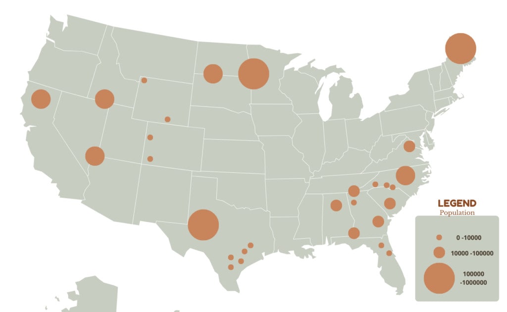
Graduated Symbol Map
- These thematic maps display data by using a variety of symbols to show data instead of colors. Typically larger symbols mean a higher concentration of data, and smaller ones are for a lower concentration.
- Like choropleth maps, the data in a graduated symbol map is put into different categories, separated by symbols instead of colors. The number of symbols depends on the number of categories you create.
4. Navigational Charts
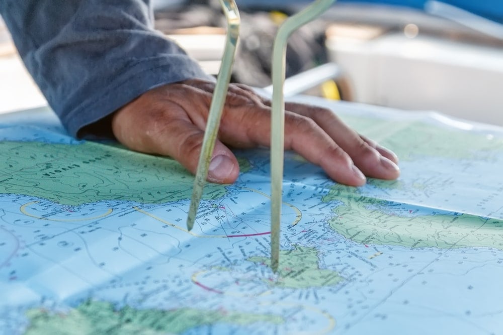
Navigational charts combine various aspects of other maps. That includes general reference maps, topographic and thematic maps. They are produced for a specific purpose instead of being made for a specific set of data.
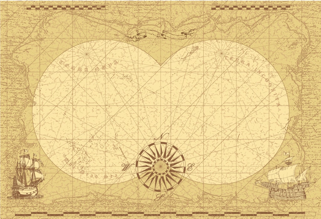
These charts aid in navigation for things like ships, aircraft and boats. When we think of navigational maps, we often think of something similar to the picture below.
This old style of the navigational map has been retired from places other than above a mantelpiece. However, they are still helpful when combined with technology. The Navy and air force still use various types of navigational maps to display information and those who enjoy sailing.
Even more than topographic maps, navigational maps need to be very accurate. Navigational maps adhere to well-defined standards to ensure this necessary level of accuracy.
You can find some of the requirements given by the International Hydrographic Organisation (IHO). For example, one of their recommendations is that nautical charts no longer just use black and white color schemes. Instead, they recommend nautical charts have a minimum of four colors, often a mixture of black, blue, magenta and grey.
Most of the time, government mapping agencies are the ones that can produce maps of such a caliber. For example, the United States Navy produces marine navigation charts. That can also include related civil defense bodies.
If you have noticed, even though this article is about the different kinds of maps, we are calling this category “charts.” That is because of a distinction that emerged between maps over 5,000 years ago that we honor today.
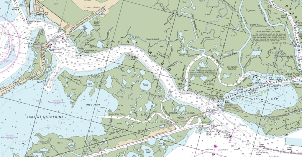
NOAA Office of Coast Survey / PUBLIC DOMAIN / WIKIMEDIA COMMONS
The difference between these two categories of maps was what they mapped. One category mapped pieces of land while others were maps of water bodies. Those that laid out terrestrial features were maps. Charts gave definition and navigational guidance to water bodies.
They would both overlap in certain places, like the coastline. Both maps and charts define the coastline and pull out some predominant features. These features were those that could be dangerous to ships, such as submerged rocks. However, it would also include land features that would help guide the navigator, such as cliffs or lighthouses.
Navigational charts relating to the water include technical information for water-based travel. The information often includes water depth and characteristics of a particular area. Some of these include information about areas being covered in fog, storms or powerful tides during a particular month.
Air navigational charts started in the 20th century after the invention of flight. They are now produced at a wide variety of scales. However, most of their safety information concerns have to do with landing.
Air navigational charts show height displayed in essential spots in feet above sea level. All other special navigational information will be displayed on the map in purple.
As technology develops, the accuracy of maps becomes better. The amount of information deepens to make navigation less dangerous.
5. Cadastral Maps and Plans
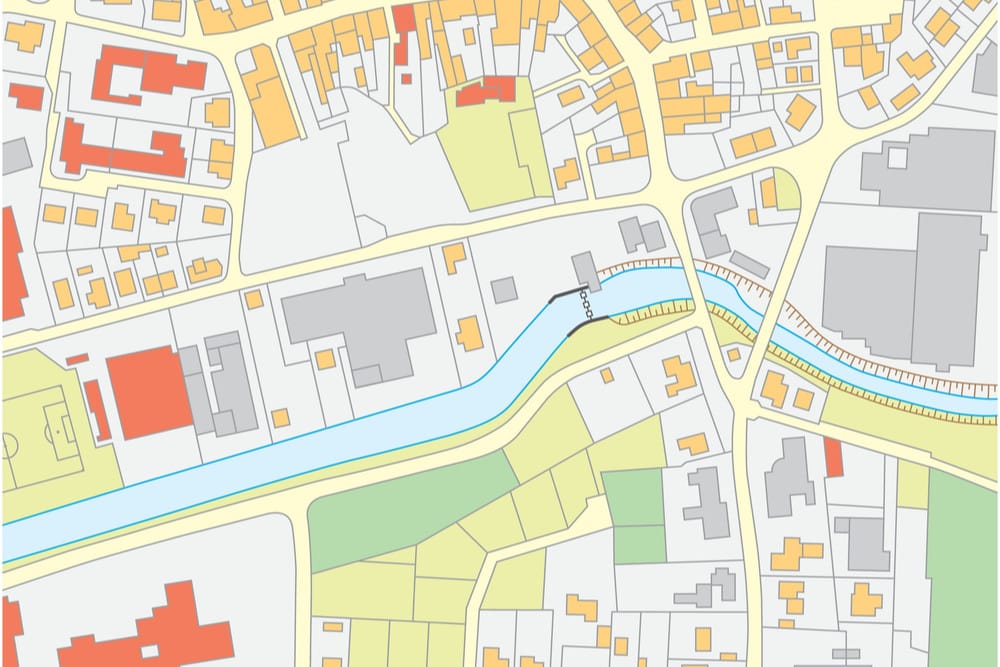
Before we understand what a cadastral map is, we should know the definition of the cadastre. A cadastre of a country is a register of property titles managed by the government. The name of the government agency that holds these titles depends on the country. In some countries, the records also record the value of the property. For example, in Australia, they are held by the Land Titles Offices.
A cadastral plan is also known as a survey plan. It is produced by the registered and licensed surveyor that measures the boundaries for each new property. These maps are created each time a new land parcel is created.
Cadastral plans and the information they contain are different in each country. It all depends on the level of local legislation that the cadastral plan pertains to.
You May Also Like: Different Types of Knots That Every Adventurer Should Know
Map Design
The design of a map or chart varies depending on the kind of map you have. However, there are certain design aspects and symbols that are shared across almost every kind of map.
Common Map Symbols
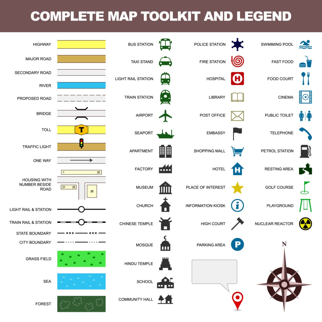
The symbols on a map vary a lot depending on the type of map you read. For example, you could read a general map for a National Park in America. You will see symbols indicating trails, restrooms, visitor centers and the entrance or exit points.
There are certain symbols or features whose inclusion doesn’t vary much no matter what kind of map you have. These include a:
- Title
- Legend
- Grid
- Compass Rose
- Scale
Map Title
The title of a map is pretty simple. It is the name of the map and should be clear. The title should describe the theme or the subject of the map. In addition, they should depict the applicable information that should pertain to the audience that will use the map.
Map Legend
The legend is one of the most critical aspects of the map. The legend will display all the symbols, styles, and colors the cartographer used to develop the map. The legend represents all the geographic data included on the map.
The legend should show an example of each of the symbols on a map. There will be a brief explanatory text associated with the symbols. The legend should be clear and brief to make it as easy as possible to understand the map.
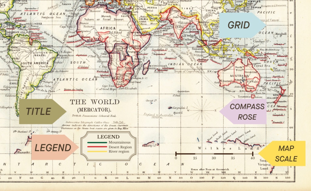
Map Grid
Almost every map will have a grid that will be faded into the background. A grid across the map will help you understand the scale. It is a network of evenly spaced vertical and horizontal lines to identify locations and distances on a map.
Map Compass Rose
A compass rose is a symbol that will show the direction of the map as it is oriented in the world. Be aware that North is not always towards the top of the map. Often, the compass rose will only be an arrow that directs you to the North instead of a whole slew of directions.
Map Scale
We have already touched on how the scale of maps works. On a map’s design, you will often find the scale tucked into one of the corners. If there is an informational column, this column will often include the scale in this section.
The information for the scale will contain the numbers representing the scale. There will often also be a scale bar to make it easier to read while referencing the rest of the map. This bar will show you what the scale means in increments, often in multiples of fives, tens or hundreds, depending on the scale.
Be a Navigator: The Relationship Between the Map, Compass and Sextant
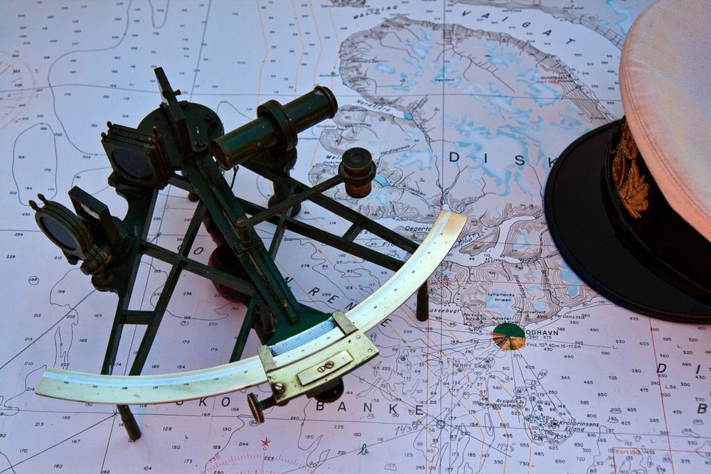
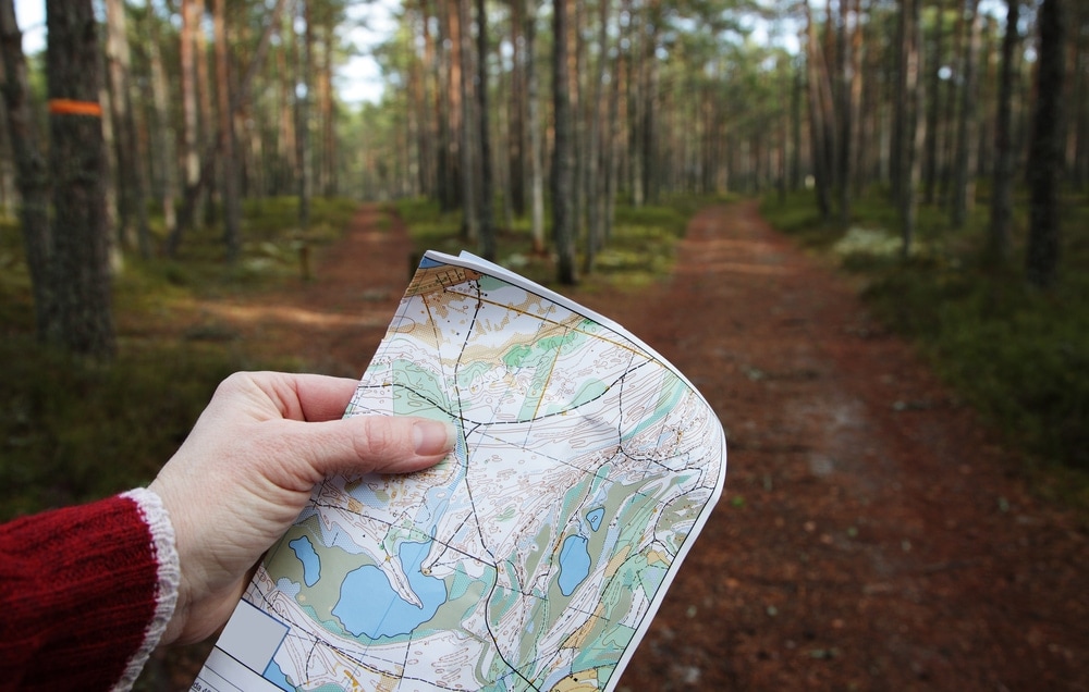
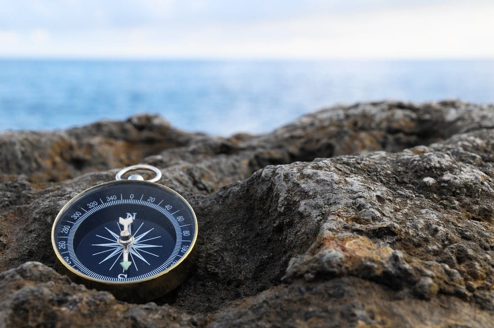
Being a navigator in today’s day and age is not one of the foremost skills learned in schools. However, it can be a useful skill if you want to navigate without the use of a phone or other GPS device. Understanding navigation is also a great way to look into world history. It helps you understand the challenges faced by explorers worldwide.
There are three primary tools used to navigate precisely. One of these is the map, the other a compass and a sextant.
The map has been covered in detail in the article above, and a compass is still used to figure out where North is. However, a sextant is a tool that has been lost to history.
A sextant measures the angle between two objects. These objects need to be fixed. For example, when navigating on the ocean, sailors would use the horizon and a celestial object.
Using this angle, navigators can use the angle to calculate the ship’s position on the nautical charts.
You May Also Like:Different Types of Tents To Consider On Your Next Outdoor Trip
Becoming a Cartographer
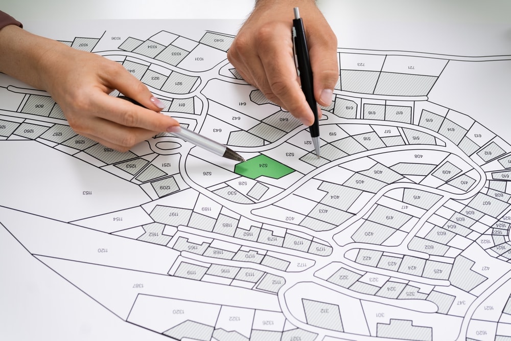
Although it might not be a typical career path anymore, cartography is still a career you can pursue if your calling is to be a mapmaker. A cartographer will often have a bachelor’s degree. There are various options for your bachelor’s degree to pursue this career later in the path. These include degrees like:
- Forestry
- Engineering
- Surveying engineering
- Geography
- Cartography
- Geomatics
- Computer science
You can also transition from similar careers into cartography. There are many people that come into the occupation after working in related careers. These include careers like mapping technicians and surveying.


